
Tailwind CSS
Tailwind CSS is changing the way we develop front-end applications in Bielefeld: faster, more maintainable, and with a CSS bundle that contains only what’s really needed.

Tailwind CSS Agency
Tailwind CSS is our standard framework for front-end development. Its "utility-first" approach enables custom designs without bloated stylesheets and with a codebase that remains maintainable even years later.
Custom Designs
No Theme Restrictions
Streamlined CSS Through
Automatic Purging
Rapid Development with
Consistent Quality

Why We Rely on Tailwind CSS
Traditional CSS becomes hard to manage over time. Selectors override each other, stylesheets grow uncontrollably, and every change carries risks. Tailwind solves this problem with predefined utility classes that are used directly in the HTML. The result is predictable styling without unintended side effects. For our web development, this means faster implementation, fewer bugs, and a CSS bundle that contains only the classes we actually use. Tailwind gives us the flexibility for custom designs without the drawbacks of large CSS frameworks.
Design Freedom Instead of a Framework Look
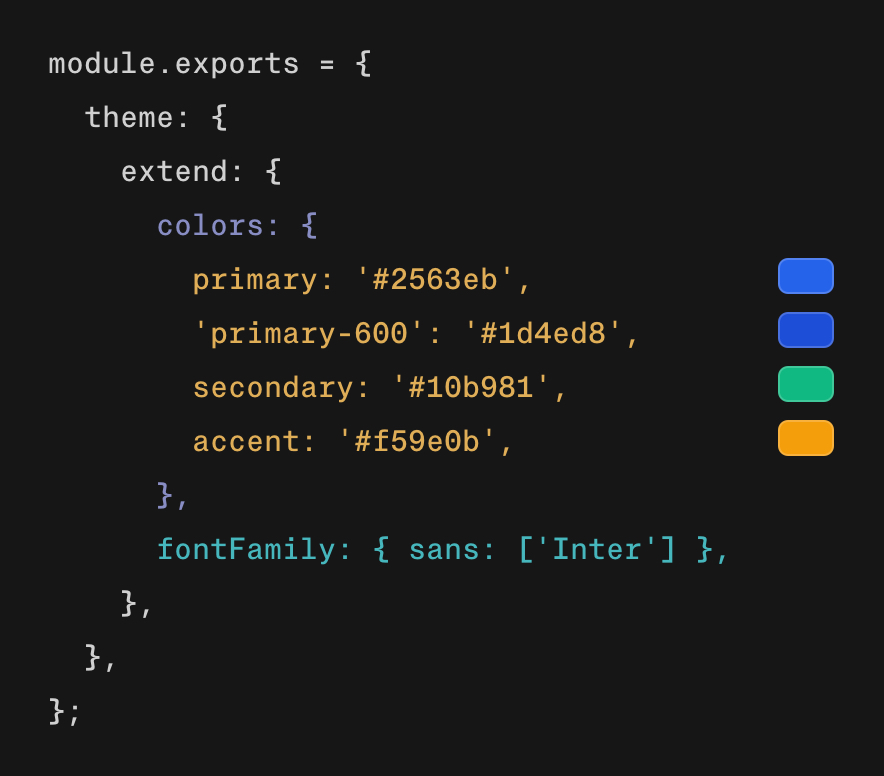
Many CSS frameworks come with their own look and feel. Bootstrap pages look like Bootstrap. Tailwind is different: It doesn’t provide ready-made components, but rather the building blocks to create your own. Your web design remains unique because each class controls only one property. This gives us full control over the visual outcome. We configure colors, spacing, font sizes, and breakpoints in a single central file. This creates a consistent design system that reflects your brand, not the framework.
Tailwind CSS is used extensively across various project areas at seitenweise. From responsive layouts to component libraries and accessible interfaces, the framework provides the technical foundation for a consistent, maintainable front end.
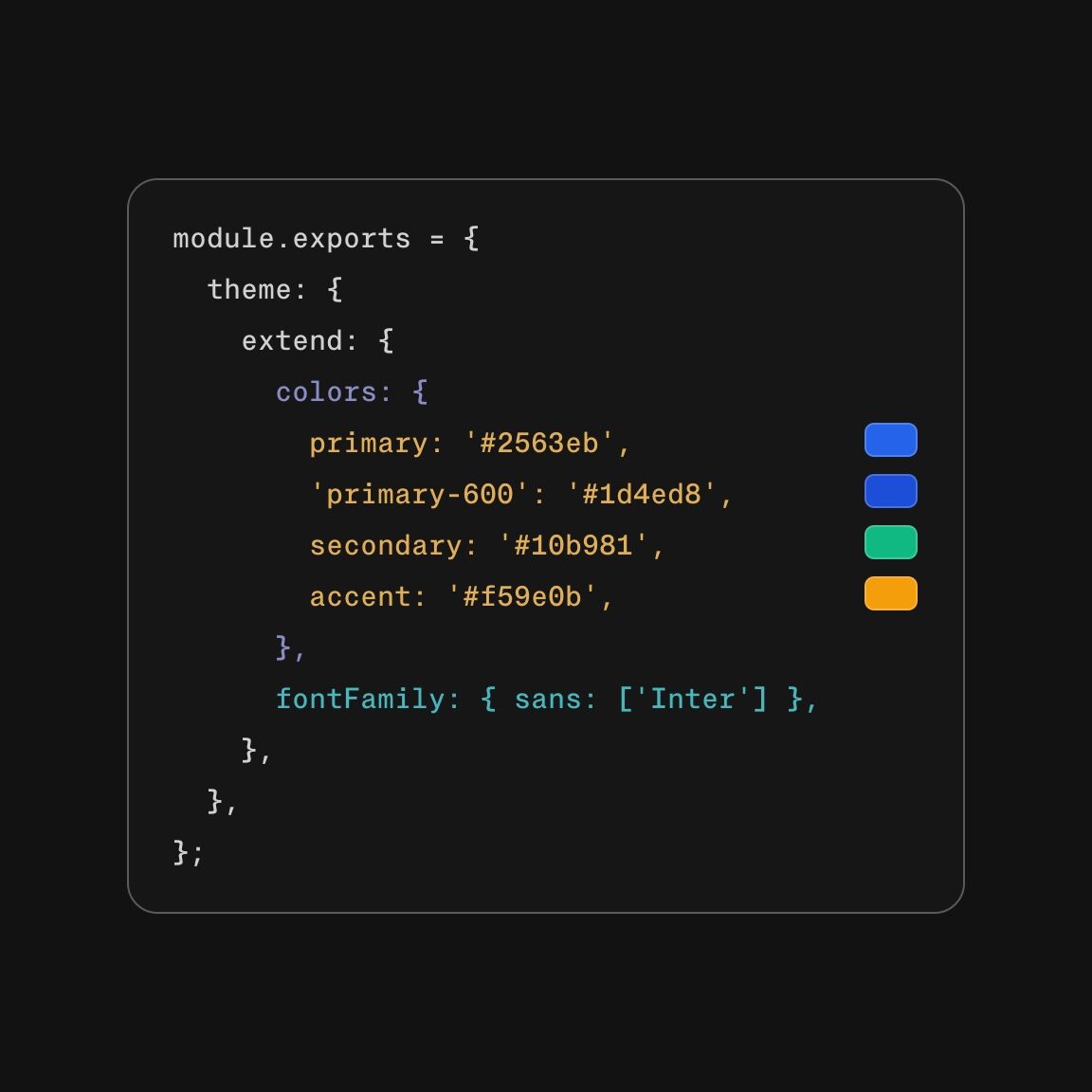
Design System
Tailwind makes it easy to set up a project-specific design system. In the configuration file, we centrally define colors, fonts, spacing, and breakpoints. The team works with standardized values, and the design remains consistent across all pages.
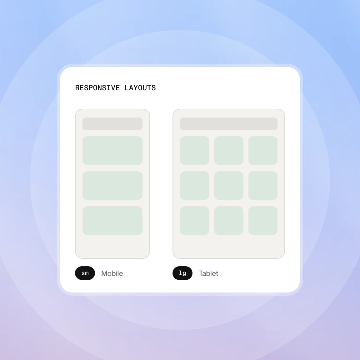
Responsive Layouts
Tailwind offers responsive utility classes for every breakpoint. "Mobile First" is the standard: first the smartphone layout, then adjustments for tablets and desktops. We use the breakpoint prefixes (sm, md, lg, xl) to build layouts that work on every device.
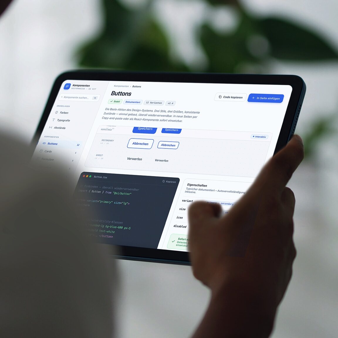
Component Library
Reusable components speed up development and ensure quality. Using Tailwind, we’re building a library of buttons, cards, navigation elements, forms, and other UI elements. Each component is documented and can be used immediately on new pages.
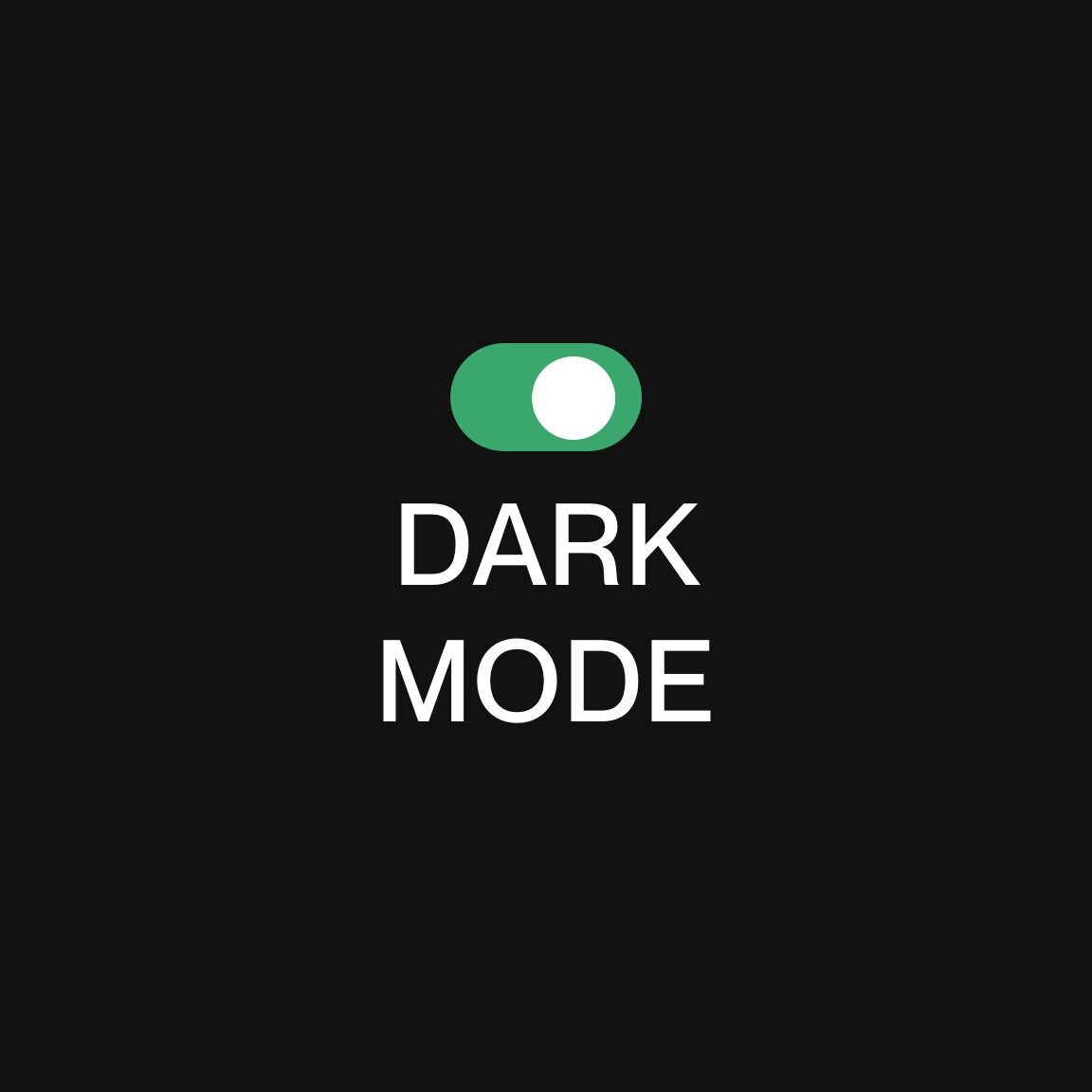
Dark Mode
Tailwind natively supports Dark Mode via the `dark:` prefix class. We implement color schemes that can be switched automatically or via a toggle. Configuration is centralized, ensuring that all components consistently apply the mode change.

Animations and Transitions
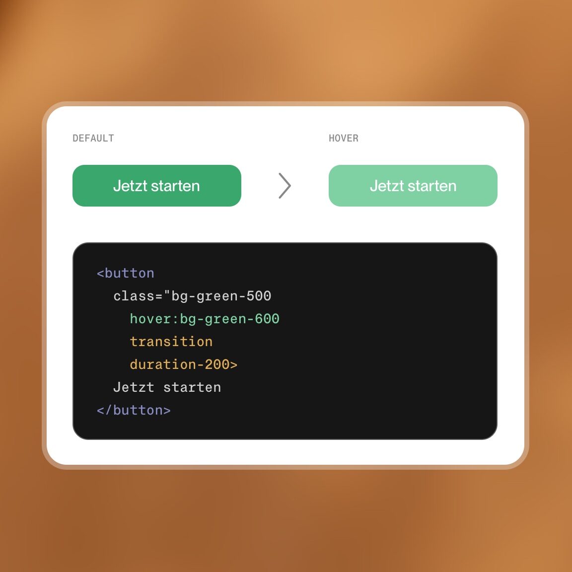
Tailwind includes utility classes for animations: transition, duration, ease, and hover effects. For more complex animations, we add our own keyframes in the configuration. The result is subtle, high-performance interactions that enhance the user experience without slowing down load times.
Accessibility
Tailwind offers classes for screen reader text (sr-only), focus states, and contrast. We build accessibility into our designs from the start and use the utility classes to combine semantic HTML with accessible styling. This results in interfaces that work for all users.
These companies know how we work


“Utility-First” means that instead of writing our own CSS classes with descriptive names, we use predefined classes directly in the HTML. Each class controls a specific property: color, spacing, font size, or Flexbox behavior. This may sound unusual at first, but it has clear advantages. The code is self-explanatory because the styling is visible in the markup. There are no hidden CSS files with unclear selectors. Changes take effect locally and don’t affect other components. For teams, this means less coordination, faster reviews, and a consistent coding style. It takes a little getting used to at first, but after a few days, the workflow is faster than with traditional CSS. We’ll train your team on how to use Tailwind if needed. For us as a Tailwind CSS agency, this is the reason why projects remain maintainable.
„Working with an agency requires good ideas, cutting-edge technology, and clear budgets with no surprises. But the personal chemistry has to be right, too. With seitenweise, everything was just right. It was really fun.“

Mathias Schwaben
Intervideo
„In addition to the entire team’s tremendous expertise, we especially appreciate how easy and quick it is to get in touch with them, even when things get urgent. Every problem, no matter how small, is taken seriously and resolved immediately.“

Julian Ellermann
arcus physio
„seitenweise impressed us with fast delivery, friendly communication, and their patience in incorporating our requests! If you want a fast, attractive, and SEO-optimized WordPress website, you should have one built here.“

Michael Bykovski
Computerra
„The team at seitenweise consists of our graphic design and web development professionals. Whenever we need help, they’re always there for us—quickly and reliably. Thank you for the great collaboration!“

Sandra Meder
Sage
„Working with an agency requires good ideas, cutting-edge technology, and clear budgets with no surprises. But the personal chemistry has to be right, too. With seitenweise, everything was just right. It was really fun.“
Mathias Schwaben
Intervideo
„In addition to the entire team’s tremendous expertise, we especially appreciate how easy and quick it is to get in touch with them, even when things get urgent. Every problem, no matter how small, is taken seriously and resolved immediately.“
Julian Ellermann
arcus physio
„seitenweise impressed us with fast delivery, friendly communication, and their patience in incorporating our requests! If you want a fast, attractive, and SEO-optimized WordPress website, you should have one built here.“
Michael Bykovski
Computerra
„The team at seitenweise consists of our graphic design and web development professionals. Whenever we need help, they’re always there for us—quickly and reliably. Thank you for the great collaboration!“
Sandra Meder
Sage
Frequently
Asked
Questions
Slim
Maintainable

We build front ends that scale seamlessly.
seitenweise is a digital agency based in Bielefeld with many years of experience, founded in 1999. The team has served over 100 clients and completed more than 500 projects. Tailwind CSS serves as the front-end foundation for many of these projects. We systematically use Tailwind in combination with WordPress, ACF, Timber, and Vite for custom web projects. The “utility-first” approach aligns with our way of working: fast, agile implementation; clean and maintainable code; and long-term scalability. In addition to front-end development, we offer web design, UX/UI design, SEO optimization, and content strategy. Our clients are based in Bielefeld, East Westphalia, and throughout the German-speaking world.
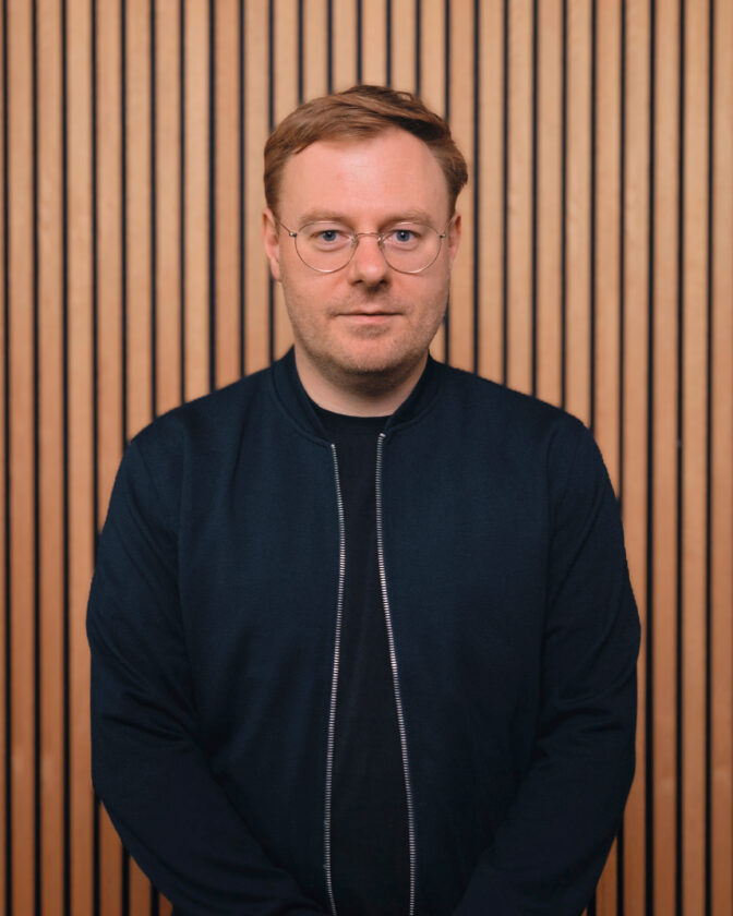
Marcel and André are your points of contact at seitenweise. They'll be happy to answer any questions you have about Tailwind CSS.

Tailwind CSS is our tool for fast, maintainable, and customizable web projects. Tell us what you're planning, and we'll show you how Tailwind fits into it.